
Leesbaarheid van medicijnverpakkingen betekent hoe duidelijk patiënten de instructies op een verpakking of bijsluiter kunnen vinden, begrijpen en volgen. Een duidelijk ontwerp helpt mensen om medicijnen veilig te gebruiken. Het verlaagt de kans op fouten en voldoet aan de wettelijke regels in de EU en de VS. Leesbaarheid ondersteunt betere resultaten voor de patiënt, veilig gebruik en eenvoudiger gebruik, vooral voor oudere volwassenen, zorgverleners of mensen met een beperkt gezichtsvermogen of leesvaardigheid.
- Goede leesbaarheid verbetert de veiligheid, het begrip en het vertrouwen van de patiënt.
- EU-regels vereisen braille, duidelijke taal en gebruikerstests op bepaalde verpakkingen.
- De Amerikaanse etiketteringswetten omvatten het "Drug Facts"-formaat, minimale lettergrootten en contrastregels.
- De lay-out van het ontwerp, het formaat van de verpakking en de materiaalkeuze hebben allemaal invloed op hoe duidelijk je boodschap is.
Waarom de leesbaarheid van medicijnverpakkingen belangrijk is
Duidelijke medicijnverpakkingen helpen patiënten fouten te voorkomen en instructies op te volgen. Het ondersteunt veilig gebruik door dosering, opslag en waarschuwingen gemakkelijk vindbaar te maken. Te kleine of moeilijk leesbare tekst kan gevaarlijk zijn. Overvolle etiketten, slecht contrast of gevouwen gebieden die informatie blokkeren, leiden tot verwarring of gemiste doses.
Sommige patiënten hebben moeite met lezen vanwege hun leeftijd, gezichtsproblemen of leesniveau. Velen zijn afhankelijk van verzorgers of spreken een andere taal. Eenvoudige lay-outs en gemakkelijk taalgebruik geven iedereen een betere kans om medicijnen veilig en correct in te nemen.
EU- en VS-regels die de leesbaarheid beïnvloeden
Regels in Europa
In de EU moeten etiketten en bijsluiters de QRD-template volgen. Dit is een gestructureerde lay-out met duidelijke bewoordingen en een logische volgorde, die moet worden getest met gebruikers. Het doel is om mensen te helpen de belangrijkste boodschappen als eerste te vinden en te begrijpen hoe ze het geneesmiddel moeten innemen.
Deze extra functies zijn ook vereist op sommige verpakkingen:
- Een 2D-barcode voor veiligheidstracering
- Een verzegeling die knoeien onmogelijk maakt
- Braille met de naam van het geneesmiddel voor mensen met gezichtsverlies
Elke toevoeging neemt ruimte in beslag, dus we plannen zorgvuldig. Onze lay-outs voorkomen dat andere tekst wordt geblokkeerd en houden alles duidelijk en conform.
Regels in de Verenigde Staten
In de VS moeten receptvrije medicijnen de "Drug Facts" lay-out gebruiken. Deze toont informatie in een kader met vaste lettergroottes, vette koppen en eenvoudige woorden. De FDA beveelt duidelijk kleurcontrast aan, zoals zwarte tekst op een witte achtergrond, en ruimte tussen de gedeelten om verwarring te voorkomen.
Structuur, lettergrootte en lay-out helpen gebruikers om belangrijke instructies snel te vinden. Deze regels zijn vooral belangrijk voor patiënten die de verpakking voor gebruik één keer lezen, zonder extra hulp.
Structuur verbetert de leesbaarheid van medicijnverpakkingen
Een goede lay-out helpt mensen een label te scannen en stap voor stap te begrijpen. Grote, duidelijke lettertypen en open ruimte verminderen de leeslast. De grootte en vorm van kleine letters, bekend als x-hoogte, helpen bij de leesbaarheid. Ruimte tussen regels, koppen en blokken maakt het scannen makkelijker.
Waarschuwingen moeten goed zichtbaar zijn. Barcodes mogen niet naast belangrijke tekstgedeelten staan, omdat ze de visuele aandacht afleiden. We plannen de afstand en plaatsing al in een vroeg stadium van het ontwerp. Onze teams ondersteunen een duidelijke lay-out van labels en een overzichtelijke plaatsing van codes, zodat elk element op de juiste plek blijft.
Verpakkingsontwerpen die duidelijk gebruik ondersteunen
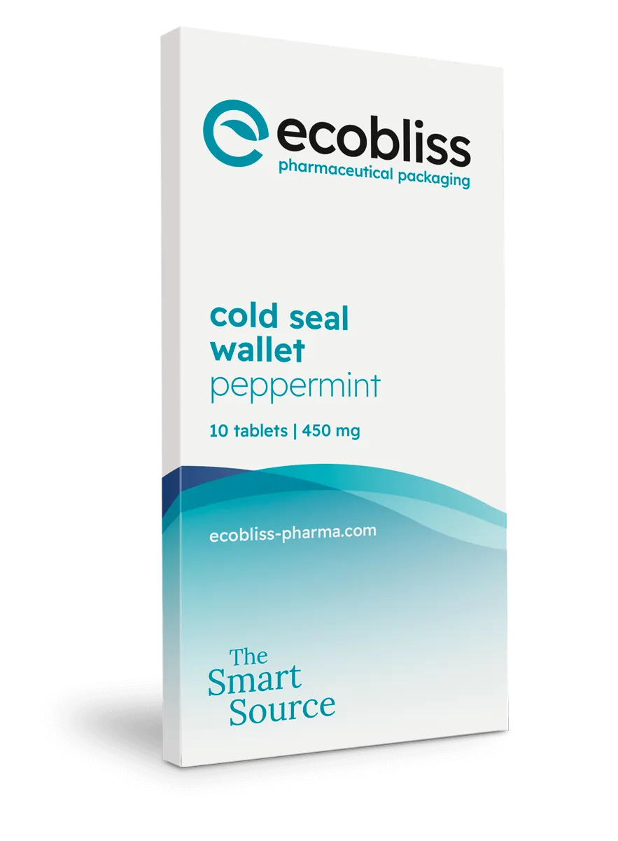
Sommige formaten helpen gebruikers bij het volgen van stapsgewijze of getimede doseringen. Met Wallet en kalenderblisters kunnen patiënten een schema volgen, wat handig is bij titratie of behandelingen van meerdere weken. Deze lay-outs verbeteren de therapietrouw en verminderen het aantal gemiste doses.
Adapter cards en trays bieden meer ruimte voor duidelijke instructies, grotere lettertypen of extra talen zonder dat het er rommelig uitziet. We gebruiken ook cold seal cards die leesbare formaten ondersteunen. Deze voorkomen hitte tijdens de productie, waardoor de oppervlaktekwaliteit wordt beschermd en de gedrukte tekst scherp blijft.
Ontwerpen voor echt gebruik
Buiten de ontwerpkamer gebruiken patiënten hun medicijnen in allerlei situaties. Weinig licht, trillende handen of onwel zijn kunnen een verschil maken. Tekst moet nog steeds gemakkelijk te vinden en te begrijpen zijn. Gevouwen labels mogen waarschuwingen niet bedekken of talen zonder ruimte naast elkaar zetten.
Een goed ontwerp van de verpakking ondersteunt de duidelijkheid:
- Pictogrammen en symbolen die taken snel uitleggen
- Duidelijke kleurgecodeerde gebieden om verschillende talen op te splitsen
- Boodschappen bij kleppen, zegels of breuklijnen om het gebruik op het juiste moment te begeleiden
Eenvoudige woorden verbeteren het scannen. Bijvoorbeeld, "Neem 1 tablet in de ochtend" is beter dan lange, juridische instructies. Dit houdt de boodschap direct en nuttig.
Veilige openingsfuncties zonder verlies van duidelijkheid
Kindveilige verpakkingen beschermen tegen onbedoelde toegang, maar moeten nog steeds gebruiksvriendelijk zijn. Moeilijk te openen ontwerpen of slechte etikettering kunnen leiden tot gemiste doses of snijwonden. Oudere gebruikers of mensen met beperkte handkracht hebben behoefte aan duidelijke visuele aanwijzingen en stappen bij het te openen gedeelte.
We ontwerpen kindveilige verpakkingen met openingsinstructies die gebruikers helpen correct te handelen, terwijl tegelijkertijd aan de veiligheidseisen wordt voldaan. Dit maakt het uitproberen en fouten maken bij het hanteren van het geneesmiddel overbodig.
Duurzame materialen die leesbaar blijven
Een leesbare verpakking kan ook milieuvriendelijk zijn. Gerecycled karton en kleefstoffen op waterbasis bieden bijvoorbeeld nog steeds goede oppervlakken voor drukwerk met een hoog contrast. Ze behouden hun sterkte en vlakheid, zodat labels leesbaar blijven tijdens transport en opslag.
We hebben dit aangetoond in een casus over het verbeteren van de patiëntervaring zonder aan duidelijkheid in te boeten. In dat voorbeeld combineerden we duurzaamheid met een betere gebruiksvriendelijkheid door dit vanaf het begin in de structuur te integreren.
Controleer de leesbaarheid voor de lancering
Voordat je de productie opschaalt, test je de lay-out met je hele team. Dit omvat kwaliteit, artwork, techniek en medisch schrijven. Kijk naar risico's zoals kleine lettertypes, strakke vouwen, slecht contrast of onduidelijke plaatsing.
U kunt een Quickscan van uw huidige verpakking aanvragen. Dit helpt u om problemen vroegtijdig op te sporen en latere herontwerpkosten te voorkomen. Het zorgt er ook voor dat uw verpakking vanaf de eerste batch de patiënt optimaal ondersteunt.
FAQ
What is medicine packaging readability?
It is how easily patients and caregivers can read and follow the information on a medicine pack or leaflet. Good readability supports safety and correct use.
Why does packaging readability affect patient safety?
If patients cannot read or understand how to take their medicine, they may skip doses or take the wrong amount. Clear labels help avoid these mistakes.
What do EU rules say about medicine label design?
European packs must use the QRD format, plain language, and often include Braille, a 2D barcode, and tamper features. User testing is sometimes required.
How can I check if my packaging is readable?
Review font size, layout, fold lines, and contrast with your full team. You can also contact us to discuss any risks before production.
Can sustainable materials still support clear labeling?
Yes. Recycled boards and water-based glue can still take sharp prints. They allow high-contrast, durable labels without hurting readability.
Vraag nu een gratis monster aan!