
Request a free sample now!

Accessibility in pharmaceutical packaging means people can open, understand, and take their medicine correctly, even if they have trouble seeing, moving their hands, or remembering things. It helps people take the right dose, reduces mistakes, and meets both safety and regulatory needs. Inclusive design supports human factors by making packaging easy to use and understand at home without medical help.
• Reliable accessibility lowers medication mistakes and helps people follow their treatment at home.
• Child-resistant and senior-friendly packaging must meet ISO 8317 and EN 14375 standards.
• Inclusive packaging uses touch and visual signals to help users follow the right dose routine.
• Cold-seal blister wallets make text easier to read, instructions clearer, and layouts more flexible.
• Early usability testing is important to make sure the packaging stays accessible when scaled up.
What accessibility means in pharmaceutical packaging
Accessibility in pharmaceutical packaging is not about how it looks or how convenient it is. It’s about making sure patients or caregivers can find, open, and use the medicine safely, no matter their age or ability. This includes people with poor eyesight, weak grip, memory problems, or who are new to the product. The packaging must help them use the medicine correctly without needing a professional’s help.
Inclusive packaging follows human factors in pharma by focusing on how people see, decide, and act. It uses touch and visual guides, clear layouts, and readable instructions to reduce confusion. A clear order of steps and simple design improve safety. Standards like ISO 8317 and EN 14375 make sure packs are safe for children but still easy for older adults to open, helping with both safety and usability.
Barriers that impair user access and adherence
Some packaging designs make it hard for people to use their medicine correctly. Strong seals or stiff materials can make it too hard for seniors to open. Small print, shiny foil, or weak color contrast can make instructions unreadable. If the pack doesn’t have touch cues or clear directions, users may skip doses or take medicine at the wrong time.
Errors also happen when instructions are separate from the main packaging, forcing users to find a leaflet or follow unclear pictures. These problems grow worse with complex treatments or long-term use. Device packaging that doesn’t show the right order of steps can cause people to skip actions, leading to missed doses or treatment failure.
The human factors perspective: why design matters
Human factors engineering studies how people interact with products. In pharmaceutical packaging, it means making sure that even when someone is tired, stressed, or has limited movement, they can still use it correctly. The packaging must have clear shapes, easy opening, and a logical sequence of steps. These ideas apply to both pill packs and medical device usability, where people need clear visual and touch guidance for multiple steps.
Child-resistant and senior-friendly packaging must be carefully balanced. According to ISO 8317 senior-friendly and EN 14375 accessible blister standards, packs must be hard for children to open but easy for adults with arthritis or weak grip. These rules focus on design, required force, and feedback during use, all based on usability testing.
Child-resistant or senior-friendly? Solving the usability paradox
Designing child-resistant and senior-friendly packaging means creating packs that stop children from opening them while staying easy for adults. Closures that need too much force often fail for older users, so good designs use movement rather than strength, like press-slide trays or twist locks.
Helpful features include textured grip zones, one-way opening steps, and consistent tab placement. These details guide users to open the pack the right way and prevent mistakes. Accessibility is not about making packs simpler but about making them clearer, with steps that feel natural to follow.
Packaging's role in dose tracking and adherence
Accessible design is key to dose tracking and adherence. Blister packs with clear calendars, numbered sections, and touchable shapes help people track doses and stay on schedule. Layouts that use symbols and large text reduce memory strain and prevent missed or double doses. Rows or circular layouts support time-based routines.
When packaging itself guides the user, it cuts down confusion and reduces the need for extra help. Combining readability and instructions for use in the design turns the pack into an easy step-by-step guide. This helps seniors or patients taking many medicines or treatments with changing doses through the week.
Design responses that enable accessibility
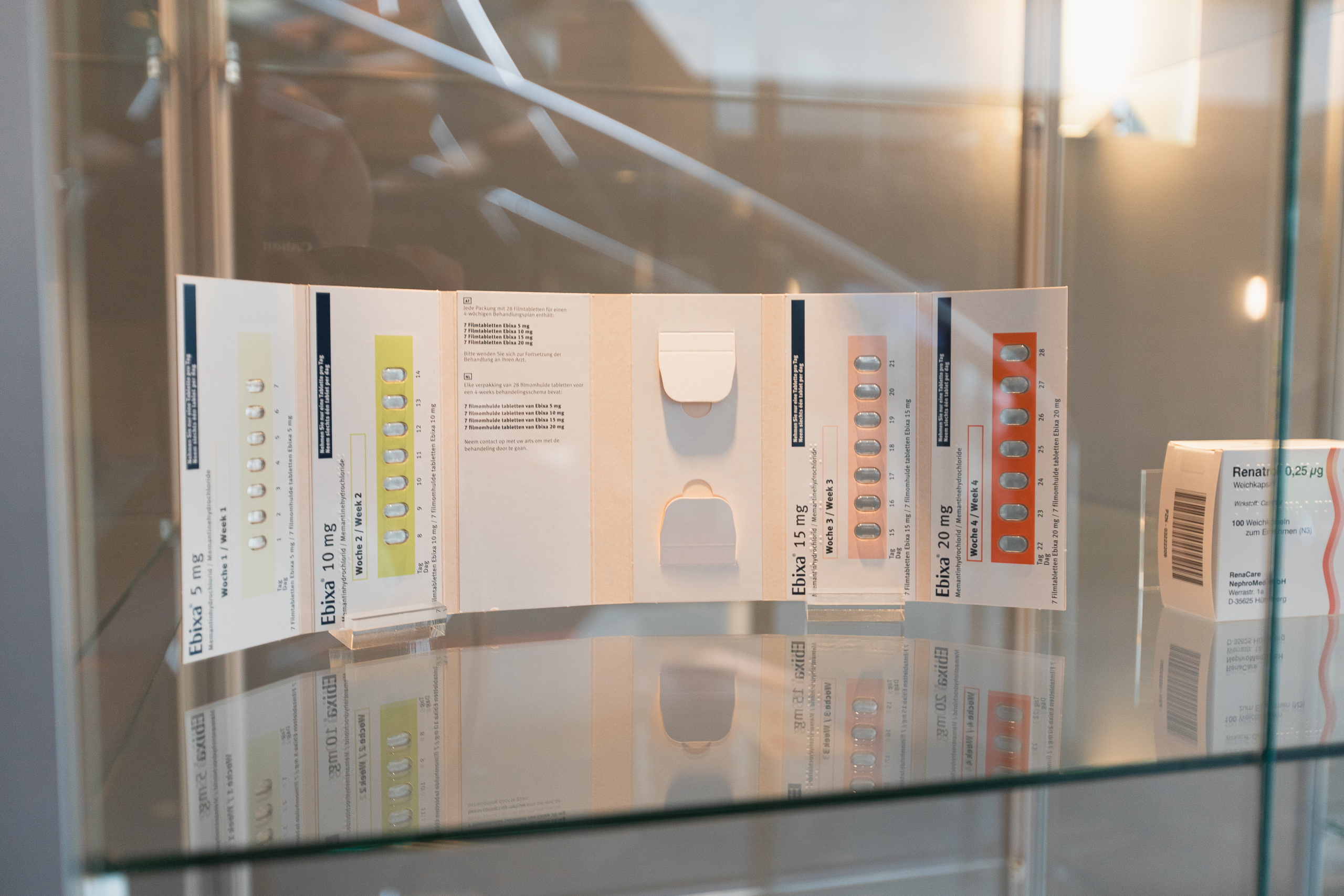
The choice of format greatly affects accessibility. Cold-seal blister wallets offer large spaces for clear text, icons, and multilingual guides. They also allow flexible cutting and perforation for better grip, clearer touch cues, and better visibility in different light conditions.
In our 168-tablet CR wallet use case, five strengths in one treatment plan are combined in one layout. Users can follow direction-based openings, color-coded strengths, and clear instructions on each fold. These design choices reduce training time, improve consistency, and make production easier by keeping one layout across all strengths.
Accessibility for complex clinical trial kits
The hardest usability challenges appear in accessible clinical trial kits, which often involve several medicines or changing doses. In these trials, packaging must clearly show when and how to move to the next stage without missing or repeating a dose. Structured trays with numbered parts and step-by-step dividers help avoid mistakes.
People with different reading, language, or thinking skills often rely on clear graphics. Icons, strong color contrast, and simple horizontal or vertical layouts make things easier to understand and use. Keeping all parts of the kit consistent helps users trust the process and protects the accuracy of trial data.
Integrating accessibility into packaging development
Accessibility must be built in from the start, not added later. Designers need to plan spacing, materials, and readability early on. This allows the right balance for opening force, grip, and resistance through the pack’s life. Usability should stay the same across all production batches and locations.
Our design & development approach uses DFM and DFX methods to turn tested prototypes into large-scale, ready-to-produce packs. We study where to add touch cues, how light reflects off surfaces, and how to keep information easy to read during printing and cutting. This keeps functionality strong when moving from design to full production.
How sustainability and accessibility can align
Improving inclusive packaging can also help the environment. Cold-seal formats use less energy during sealing and keep text readable by avoiding foil glare. Materials that are easy to separate make recycling simpler without losing touch feedback. Embedding instructions into the design saves paper and reduces pack weight.
Accessible formats like modular wallets also allow products to be combined into smaller, lighter shipments. Keeping packaging clear but minimal supports both accessibility and sustainability goals.
How we design for accessibility without compromise
We create senior-friendly design formats that work with child-resistance rules and clear layouts. Cold-seal wallets give space for printed instructions, different opening styles, and guidance zones. Friction locks or motion-based openings are tested to meet both goals: keeping children safe and making it easy for adults to open.
In the 168-tablet CR wallet use case, instructions are linked to each dose. Colors, textures, and arrows guide users through sequence and strength. This reduces confusion, lowers training time, and brings usability benefits into daily operations or custom packaging steps.
Assess your packaging with our Quickscan
Reviewing your current accessible packaging can reveal hidden problems in how instructions are placed, how the pack opens, or how users follow the steps. Our Quickscan accessibility assessment finds issues like too much opening force, low color contrast, or missing touch or visual cues. This helps improve existing designs or choose better formats.
The Quickscan is made for packaging managers, CMC leaders, and procurement teams who want to include user-focused design in their current work. It supports everything from trial kits and blister wallets to medical device trays and combination packs.
FAQ
What does accessible pharmaceutical packaging look like?
Accessible packaging uses large text, clear layouts, touch markers, and simple openings. Visual instructions match the physical pack, making it easy to follow the dosing routine.
How does accessibility relate to regulatory packaging requirements?
Standards like ISO 8317 and EN 14375 require packaging that is safe for children but easy for adults to open. Good accessible packaging meets these rules with secure designs and easy-to-use features.
Can accessibility reduce packaging errors or helpline calls?
Yes. By using visual and touch guidance, accessibility reduces confusion and the need for extra help, lowering the chance of mistakes when people use the product on their own.
What is the role of tactile cues in packaging?
Touch cues help people with vision or movement challenges open and use packs correctly. These features give feedback and make use easier over time.
How early should accessibility be considered in packaging development?
It must start in the first design stage. Testing and prototyping help make sure materials, locks, and layouts work well for all users during production and use.
Request a free sample now!


