
Medication packaging usability means how easily a patient can open, understand, and use their medication the right way. It affects safety, helps people stick to the treatment schedule, and prevents mistakes. Good packaging usability is especially important for patients managing treatment at home, including older adults, people using devices, or those on multiple drugs.
• Usable medication packaging reduces errors and supports safer self-administration.
• Design factors include readability, opening ease, dose timing, and pack layout.
• Packaging must stay usable for adults while staying child-resistant.
• Clear separation of strengths helps in multi-dose and titration treatments.
• Usability should be planned early to avoid delays and extra costs later.
What does medication packaging usability mean?
Medication packaging usability means how safely and easily a person can handle medicine packages. This includes opening the pack, reading instructions, tracking doses, and taking the right drug at the right time. It matters most when people take medicine at home, especially if they also deal with low vision, weak hands, or several different medications.
If the design is unclear or too hard to use, users may miss a dose, take too much, or misuse the product. These situations can lower treatment success and increase health risks. Usability helps prevent these issues by giving users a clean layout, readable text, and clear steps to follow.
Key human factors in medication packaging usability
Good packaging design focuses on how real people interact with medicine packs in their daily lives. Some users have limited strength, visual challenges, or need to use one hand. Usability details can remove barriers like confusion or wasted time. Five important design points include:
• Opening mechanism: Should work with low grip strength or with one hand. This is essential for older adults or those with physical limitations.
• Sequencing: Packs should show what to take, when to take it, and in what order. Structured layouts guide both timing and dose.
• Differentiation: Layout, color, and shape can show the difference between strengths or types of medicine.
• Readability: Font size, spacing, and contrast should support easy reading, even without extra tools or lighting.
• Feedback and tracking: Markers like tick boxes, printed calendars, or day labels help users track what they’ve already taken.
By building these factors into the packaging, users can stay on schedule without added stress or confusion. This supports better adherence, especially in long-term treatments or polypharmacy situations.
Usability versus safety: balancing child resistance and accessibility
Medicine packages must stop young children from opening them by accident. At the same time, adults need to open them without pain or delay. This includes people with arthritis, low grip, or visual impairments.
Child-resistant (CR) features like squeeze-and-turn caps can work if they also offer simple clues for adults. These may be visual marks, clear instructions, or touch points where pressure must be applied. While the CR lock is certified by the manufacturer, smart design helps all users handle the pack correctly.
So a child-safe pack does not need to block access for everyone else. Designed well, a package can be protective for children and easy-to-use for patients.
How format and structure affect usability
The shape and structure of a package can help patients follow instructions and keep treatment on track. Multi-panel wallets are often used for complex therapies, such as those with changing doses over time or patient instructions in multiple steps.
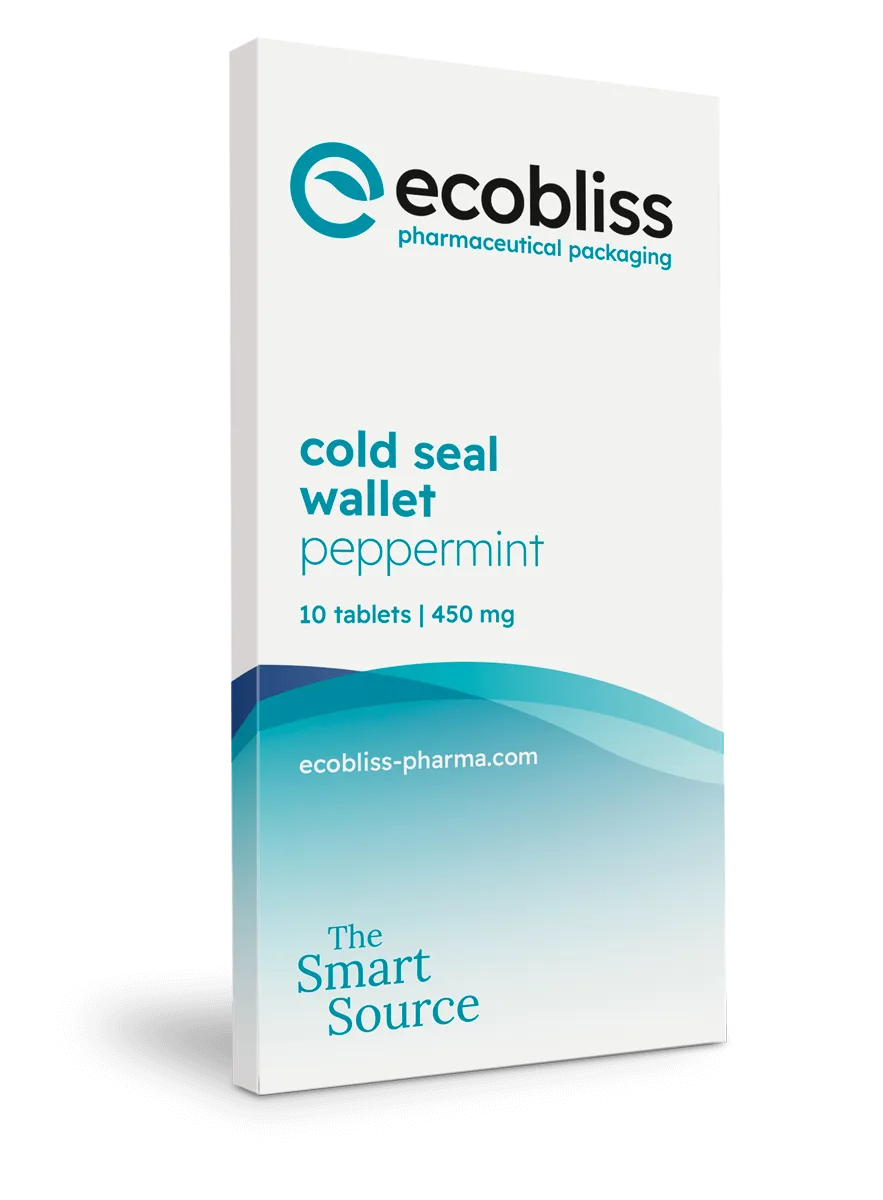
We offer cold seal blister wallets that guide the user day by day. These formats show each dose clearly, give room for instructions, and split drugs by time, week, or strength. After use, they can be separated for recycling without harming safety features.
This makes wallet designs helpful for self-treatment at home, especially when timing or titration must be followed closely.
Designing for multi-strength and complex regimens
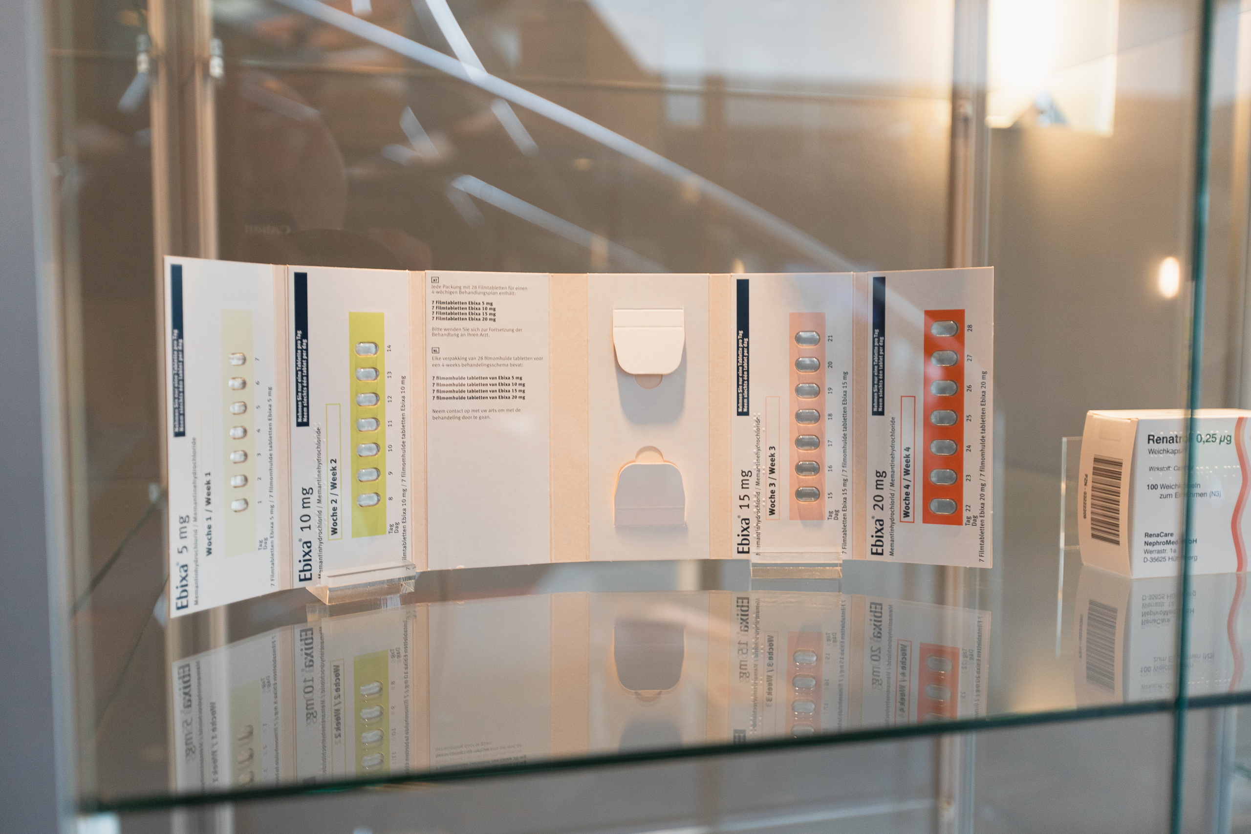
Some treatments start at a low dose and increase over time, or use different strengths together. If each strength looks the same, mix-ups happen easily. That can mean missed doses, too much medicine, or confusion about what to take next.
We show how five strengths were packaged into one CR wallet with clear strength differentiation. Each area of the wallet used color-coding and separate panels. This way, the patient could manage the full therapy without opening multiple packs or guessing. It also kept the full regimen in one place for better safety and control.
Usability in clinical trial packaging and device-inclusive therapies
Clinical trials have special challenges. Packs go to different sites, get returned partly used, or need to meet rules in several countries. They might also need to hide or split types of doses for blinding. So labels must be clear, and formats must stay readable and organized even after transport.
In device therapies, packs must hold items like pens, injectors, or syringes in the right order. If a user needs to do things step by step, each item must be easy to find, use, and return. Structured trays or wallets can support this by grouping steps visually and physically, from start to finish. Symbols, labels, and usage flow all help reduce setup errors and support self-treatment.
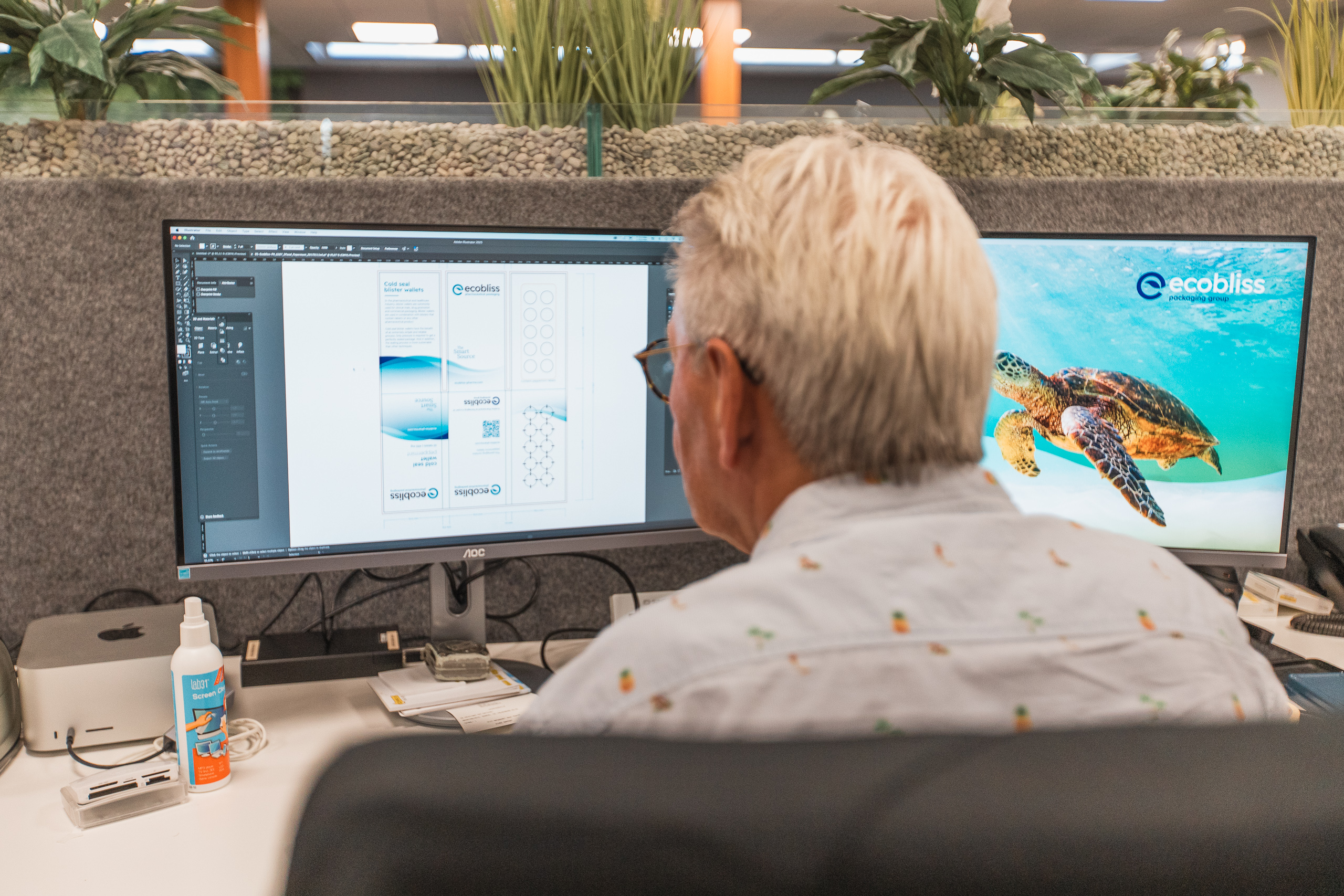
Engineering usability in early packaging development
If medication packaging usability design happens late, it might not fit the machine setup, and changes can be costly. It is better to think about usability from the start. This means designing for both the patient and the production line before final formats are fixed.
We apply design-for-manufacture (DFM) to ensure usability survives scale-up. This method builds usability into layout, opening flow, and material handling without blocking production plans. It reduces the need for redesigns and supports faster launch times.
Usability meets sustainability
When packaging is easy to open and sort, patients are more likely to use and dispose of products properly. Clear formats also lower waste and prevent damage during use. For example, when users do not need scissors or extreme force, materials stay intact and clean.
Cold seal wallets support this balance. They allow for strong visual layout and are easy to open. Because they do not need heat, energy use in production is lower. Used correctly, they separate well for recycling and support environmental goals without reducing usability.
From evaluation to implementation
To improve medication packaging usability, start by checking where users may struggle today. Look at how packs are opened, how easy it is to follow instructions, and how doses are tracked. This feedback can guide design updates that focus on real-world needs.
Request a cold seal wallet or device-supportive format to review usability features hands-on. A sample helps test grip, layout, and ease of opening with real users or internal teams.
FAQ
What makes medication packaging user-friendly?
User-friendly packaging is easy to open, clear to read, and supports correct use. It often includes large text, helpful icons, and simple layouts.
How does poor usability affect patient adherence?
When users struggle to read or open a package, they may stop taking medicine, take too much, or miss doses. This lowers treatment success and increases risks.
Can packaging be both child-resistant and easy for adults?
Yes. With clear instructions and easy-grip zones, CR locks can support safety and still allow adults to open the pack without difficulty.
Why should usability be considered early in development?
Starting with usability avoids late-stage changes that cost more and cause delays. It also helps integrate packaging into production and supports clear testing.
What formats help with dose tracking and strength control?
Wallet-style packs and structured blisters support clear tracking. They help patients see what to take and avoid mix-ups in multi-strength or titration plans.
Request a free sample now!