
Colourblind friendly medicine packaging uses design elements like contrast, symbols, and clear text to help users with limited colour vision identify medicines correctly. This improves safety, supports treatment adherence, and prevents dosage mistakes. It is especially useful in busy clinical and home settings where quick recognition matters.
• Colourblind users struggle with red-green or blue-purple packaging cues, so clear contrast and icons help avoid confusion
• Safe layouts guide patients and healthcare staff without interfering with regulatory text, codes, or braille
• Visual cues like shapes, patterns, and pictograms work well in blisters, cartons, wallets, and child-resistant formats
• We build prototypes that combine accessibility with compliance, keeping production needs in mind
• Accessible designs can also meet sustainability goals with recyclable materials and efficient inks
Why colourblind friendly medicine packaging improves safety and usability
Colourblind friendly medicine packaging helps users who have difficulty seeing certain colours, such as red or green. These colour vision deficiencies are common, especially among men. If packaging relies only on colour to show strength or time of use, users may take the wrong product or dose. This can lead to treatment mistakes or delays.
Using patterns, contrast, and clear labels makes medicines easier to identify. These design tools help patients follow instructions correctly and allow hospital staff to locate and confirm treatments faster. This is especially important in time-sensitive care settings or when managing multiple medicines at once.
Key visual elements for colourblind friendly medicine packaging
We use a set of clear design features to support accessibility. These tools improve how users process information, even in cases of colourblindness or low vision. They also help users who may struggle with language or literacy.
High contrast: We apply strong light-dark combinations to make key information stand out. For example, we avoid red-green or blue-purple contrasts and check every design in grayscale. This ensures the layout works even when colour differences are hard to see.
Typography: Large, readable fonts with enough spacing between letters help users understand text quickly. Mixed case lettering also improves recognition for users with reading challenges or reduced vision.
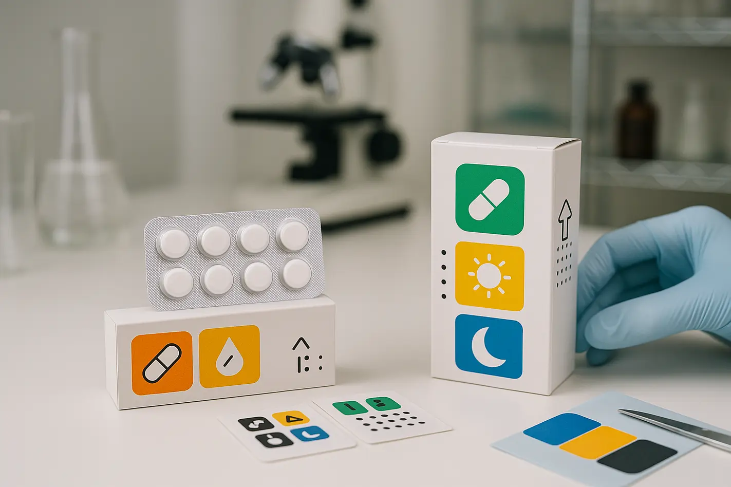
Pattern and shape coding: Unique patterns or shapes, such as stripes or geometric figures, give clear visual breaks between medicines or strengths. Placing these on the front, spine, or blisters helps users navigate the packs better.
Pictograms: Simple, tested icons like a sun for daytime or moon for nighttime offer guidance without relying on text. Icons must be clear, avoid cultural confusion, and never look like promotional graphics.
Making it work in regulated pharmaceutical packaging
Medicine packaging must include mandatory elements to meet global health regulations. These include:
• Legal product text and dosing instructions
• Batch numbers and serialization codes
• UDI and data matrix elements for scanning and traceability
• Braille for accessibility
We design colourblind friendly packaging to avoid conflict with these areas. For example, we do not place patterns under braille text, since raised dots become harder to feel. Similarly, high-contrast patterns stay away from 2D codes so scanners can capture data easily. All accessible design elements are added in safe visual zones that leave compliance features untouched.
Colourblind friendly medicine packaging in real pack formats
We bring these design elements into everyday formats such as blister packs, wallet cards, and child-resistant cartons. Each type offers its own space and layout challenges, which we can solve through custom symbols, surfaces, and printing techniques.
In blister packs, we add icons or numbers beside each cavity to show dose order or time. In wallet designs, shapes or coloured tabs make it easier to confirm dose strength or daily schedule. In child-safe cards, guides are placed where they do not affect locking tools. One example is our locked blister card design, where high contrast zones help the user while keeping the card child-resistant.
We can map specific icons to each day, like triangles for Monday and circles for Tuesday. These cues improve clarity across all vision types and can be styled to work in multiple languages or markets.
How we design colourblind friendly medicine packaging that meets user and compliance needs
We turn accessibility goals into working secondary packaging designs. This includes fitting visual cues around regular content zones, such as label areas and barcode space. We adjust layouts to meet both readability and safety needs.
Our process includes early prototyping and grayscale review to confirm if contrast and patterns are easy to recognise. We also validate pictograms for clarity and adjust them if needed. All our designs are custom-fit for each brand and are never reused across projects. You can learn more about our design and development process.
Special tips for kit components, clinical packs, and sustainability goals
In clinical kits or site-packs, fast recognition is key. Visual elements help trial assistants or patients identify contents quickly. We recommend:
• Clear icons and large text for labels
• Matchable shapes or colours for components and sleeves
• Matte or low-glare surfaces to reduce reflection under hospital lighting
We also support sustainability goals by using contrast-friendly paperboard and low-impact inks. Patterns and labels can be applied without reducing recyclability. In one real-world example, pattern-coded packs helped reduce patient confusion and packaging waste at once.
Making colourblind friendly medicine packaging part of safe, child-resistant formats
Some teams worry that patterns or icons may interfere with child safety systems. However, visual elements can be added away from locks or pressure zones. This lets users benefit from guidance cues without weakening security features.
For example, we place icons on fold flaps or rear panels so users can confirm the product without decoding small print. This helps adult and senior users while keeping full safety. Our work shows that child-resistant formats with accessible design are possible without compromise.
Next step: See and feel it for yourself
To confirm if a design is easy to use for colourblind people, we suggest testing real samples. On-screen views are not enough. Grayscale proofs and anti-glare paper help teams check what works under real hospital or home lighting.
We can provide sample packs with different layouts, icons, or shape systems. These help internal teams compare which options offer best visibility and comfort. If you are planning a project, you can request a sample set for review or testing.
Frequently asked questions
What is colourblind friendly medicine packaging?
It is packaging designed with visual features like strong contrast, shapes, and icons so users can understand the medicine even if they cannot see all colours clearly.
Why is colourblind friendly packaging important for medicine?
Many people with colour vision deficiency cannot tell red from green. If medicines use these colours to signal dose or strength, it can cause confusion and errors.
How can we design accessible packs without breaking regulatory rules?
We place icons and visual cues in free zones, away from legal text, codes, and braille. This way, all regulatory content still works as needed.
Do patterns or shapes affect child-resistant packaging safety?
No. We apply visual cues where they do not block locking systems or create opening risks. Safety is never reduced.
Can sustainable packaging still support colourblind users?
Yes. We use recyclable boards, low-glare finishes, and ink-efficient shapes that offer contrast while keeping the materials eco-friendly.
Request a free sample now!