
User-centric pharmaceutical packaging design starts from the patient and works backward. That sounds obvious. It isn't, because most pharma packaging gets designed around regulatory requirements, brand identity, and manufacturing constraints, with the patient experience as a downstream consideration. The result is packs that satisfy QA but confuse a 78-year-old at 7am.
What user-centric actually means
Three commitments built into the design process:
Test with real patients. Not internal proxies. Not focus groups of healthy 30-year-olds. The actual demographic that will use the medicine, including the elderly, the visually impaired, and patients with reduced grip strength.
Match the pack to the regimen. A daily-dose chronic medication needs a calendar wallet. A titration regimen needs color-coded steps. A medication for caregivers needs different cues than one the patient takes themselves.
Make the failure modes visible. The patient should be able to tell at a glance whether they took yesterday's dose, whether the pack has been tampered with, whether they're holding the right strength.
Patient demographics that drive design
Elderly patients (70+)
Reduced grip strength. Reduced fine motor control. Reduced vision. Often managing five or more medications simultaneously. The design priorities: large print, wide peel tabs, calendar layouts, intuitive opening direction.
Pediatric households
Child-resistance is mandatory for many pharmaceuticals. The challenge is keeping the pack senior-friendly at the same time, since a child-resistant pack often becomes unopenable for grandparents. Our Locked4Kids platform handles both.
Visually impaired patients
Roughly 30 million people in Europe live with sight loss. EU Directive 2004/27/EC mandates Braille on the outer carton. Beyond Braille, color contrast and tactile cues matter for patients with partial vision.
Caregivers
Often family members managing medications for an elderly relative. They need clearer labeling than the patient themselves, plus dosing schedules that survive translation between caregivers.
User-centric design in practice
A real example: a chronic CNS medication for elderly patients. The standard pack was a generic foil-and-PVC blister inside a folding carton. Adherence in the trial: 60%.
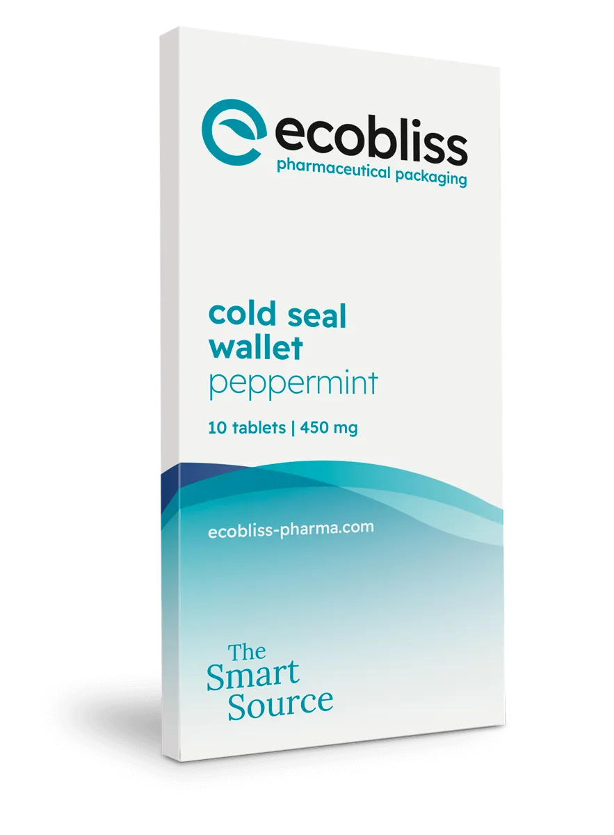
Redesigned as a cold seal wallet with calendar layout, large-print day labels, peel-and-push opening (no push-through), and a visual color difference between morning and evening doses. Adherence in the redesigned pack: 85%.
The redesign cost a few cents per pack. The 25-point lift in adherence translated to measurably better clinical outcomes.
Where user-centric design gets resisted
Two common arguments against:
"It costs more". True at the pack level, false at the program level. The cost per missed dose (clinical impact, lost adherence, payer pressure) usually outweighs the design upgrade.
"We don't have data on user needs". Run patient acceptance testing. The data exists, you just have to collect it. Six weeks and a few thousand euros gets you the answer.
If you want to make your packaging user-centric
Start with patient acceptance testing on the current pack. From there iterate on the wallet layout, the opening mechanism, the labeling. The first iteration is rarely the right one.
We've designed user-centric packs for chronic medications, oncology titration regimens, and pediatric formulations. Send us the patient profile if you want a user-centric design pass on your packaging.
Request a free sample now!